
Author (date) 'Title', full web URL
e.g. Miles, R (2010) 'A piece of Postmodern Graphics', www.graphics.com/graphics
Also, include a couple of sentences next to each image which describe why you think each image is Postmodern.'
There are traits of postmodernism in many pieces of todays graphic design so it is difficult to define a certain type of design as postmodern. However these traits are easily identifiable. The most common would be the idea that postmodernist work is based upon other pieces of work, taking something and recycling it giving it a new or altered look or meaning.
In a sense there is less innovation and originality and more development and manipulation of whats already there.
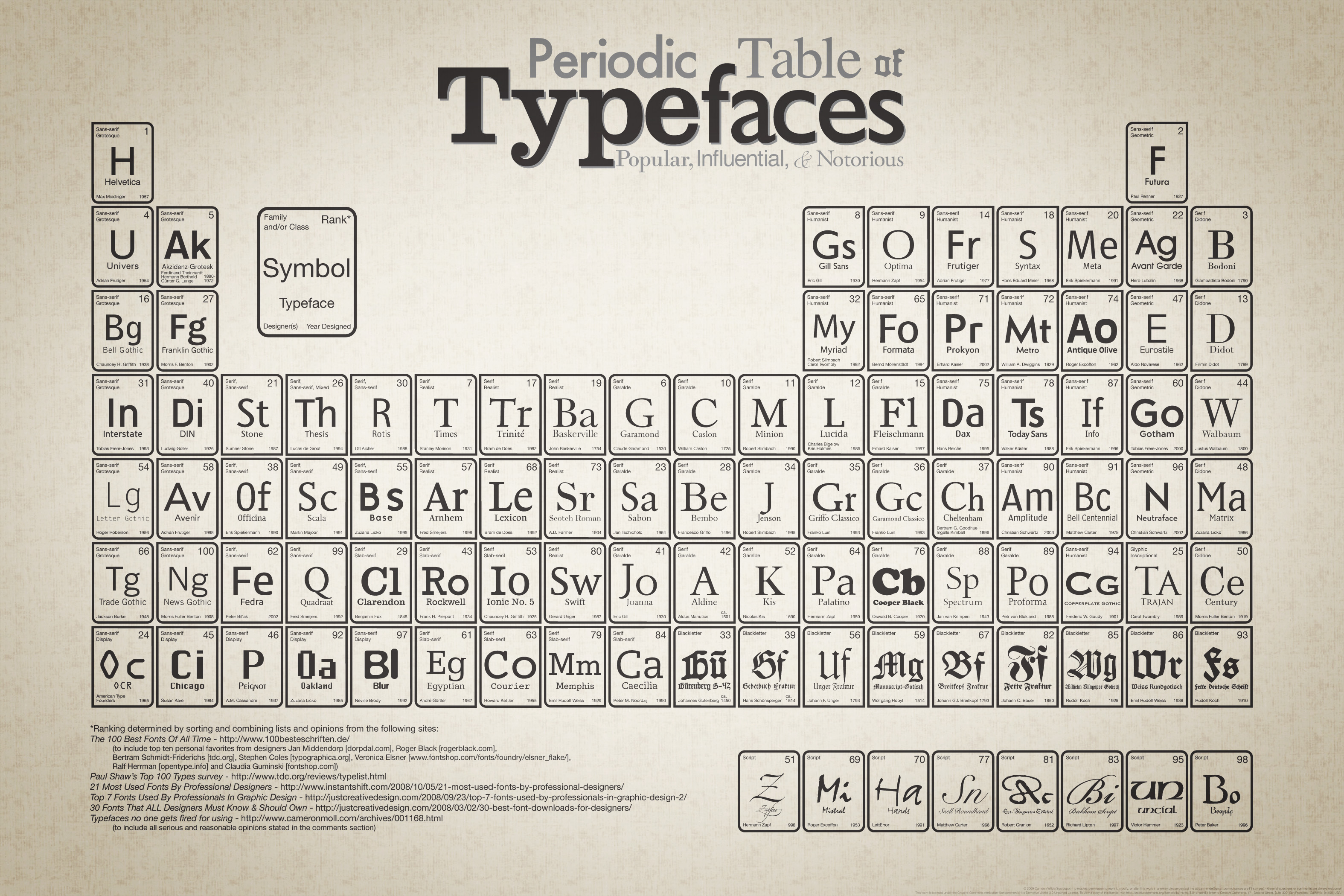 |
| Wilde, C (2009) 'Periodic Table of Typefaces' http://www.behance.net/Gallery/Periodic-Table-of-Typefaces/193759 |
This piece of design looks like the periodic table of elements that you would find in schools on walls but its been redesigned and applied to typography, its in a sense a piece of info graphics with the way it organises and categorises the fonts and their qualities. In terms of it being postmodern, it is a recycled and reinvented piece of work which is a common trait in postmodern design.
 |
| Scher, P (1984) 'Swatch Watch USA' http://classes.design.ucla.edu/Spring06/155/projects/nicole/scher.pdf |
Similarly to the previous image this once by Paula Scher (right) is a direct replica of Herbert Matters original design. There was much debate as to whether this was parody or plagiarism but it was in fact credited by Matters for its clever adaptation to promote Swatch Watch USA. Again this is a recycled piece of postmodern design.
 |
| Kruger, B (1987) 'Untitled (I shop therefore I am)' http://www.adbusters.org/content/i-shop-therefore-i-am This image was originally used in a credit card advert but here Kruger has replaced the card with this new one with a variation on the quote 'I think therefore I am'(Rene Descartes). Although this is cynical it comes across with a light hearted tone that people can easily understand as it is pointing out that we centre our worlds and lives around what we buy. Its postmodern because of of the tone and the recycled imagery and phrasing. |
 |
| Holzer, J (1984) Abuse of Power Comes as No Surprise. http://www.flashartonline.com/interno.php?pagina=news_det&id=761&det=ok&title=MOCA-honors-Jenny-Holzer- Holzer became a significant player in postmodernism when her work shifted from painting to doing type based instalments which address many tender subjects. She often puts her work out into the street and they have political agendas. This is postmodern because of its cynicism and that fat that she draws her inspiration and most of her content from older transcripts and books. |
 |
| Poynor, R (2003) 'No More Rules - Graphic Design and Postmodernism' http://designmuseum.org/__entry/4937?style=design_image_popup This is a book cover design for 'No More Rules - Graphic Design and Postmodernism' by Rick Poynor. The title in itself is an example of the ethics of postmodernism to challenge conventions and break boundaries, or 'rules'. |
Nice post. I am finding best quality graphics designer. Are you providing any type of printing service? or If you have another site like 55printing.com, share.
ReplyDeleteThank you